Learning To Make Graphs and Other Figures and Animations using D3 and Other JS Libraries
Check out the APES FRQ practice pages for Energy Word Problems — Each index page incorporates an interactive D3 animation to catch the interest and imagination of my students. Each page provides more information about the scientific concepts important to the page contents, the resources I used to make the page, and lessons I learned about coding (HTML, CSS, Javascript) in the process of creating the page.
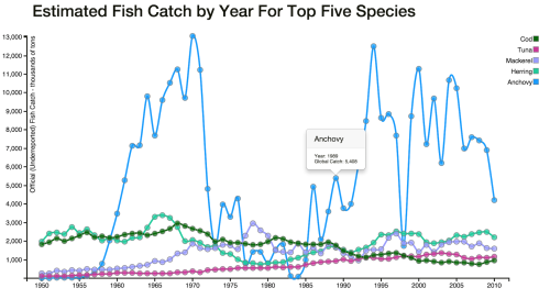 July 9, 2015. Today, I reinvested in learning D3, a javascript library, to create graphs from data that I come across that I would like to use in my APES course and also to create animations (or at least learn how to incorporate other’s animations) . Click on the image at right to interact with the graph I just made. The data, on the annual global wild catch of popular fish species from 1950-2010, is available at The Earth Policy Institute. The graph is interactive in the sense that tooltips appear when you rest the cursor on a data point. So, with the creation of this graph, I now have one good model of code to apply to other time-based data sets. I am learning how to hardcode arrays into the index.html file, create a separate JS file and reference in the index script, and also import from external CSV or TSV files. There are other data formats that I will explore as well. A good start!
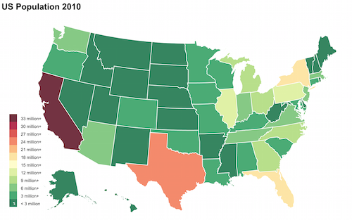 July 15, 2015. My first foray into choropleth maps with D3! Click on the image at right and hover your cursor on any state to see a tooltip with state name and 2010 population. In the process of creating this page, I came across several new and interesting resources that I think I will use much in the future. In terms of data to create topojson files, Census.gov has Shape files that can be converted to Json format at Shape Escape. Another interesting tool is MapStarter, where you can upload a variety of file formats (or use their default offerings) and it will generate an HTML file to display your map with color-filled shapes. Finally, here is a link to a world Json file and a US states/counties Json file. Ultimately, I used that us.json file and Michael Simeone’s clear instructions to build my first map. I also used Color Brewer 2 to choose the divergent color theme to to give visual meaning to the data.
Next up: I am trying to meld in some of Rich Donohue’s code from an animated choropeth graph to show the US population change with each census period from 1900-2010. Fun times!
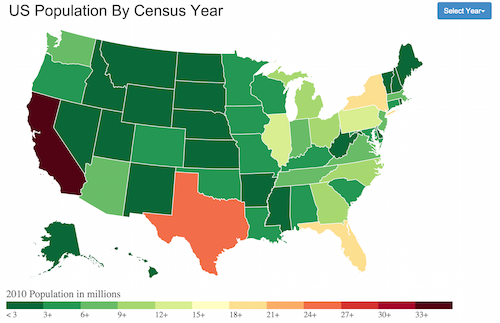
July 19, 2015. A multi-year choropleth map of US population 1900-2010! Inspired by Niall MacKenzie’s Block. Still working on adding back the tooltips that functioned in the 2010 map (above.) Click on image to try it out.
July 28, 2015. A slightly more nuanced color scheme to show smaller population shifts. It is still not quite right though. I used this gradient tool, another interesting find.
The legend is way too crowded as well. I will work on these issues. But, the main breakthrough here was to incorporate a slider to transition from year to year, rather than the previous drop down menu. Some progress 🙂 As always, click on the image to try out the slider.